Joe Zeff Design

Now more than ever, companies need to tell their story effectively. We’re here to help.

Our story . . .

Filtering by Category: Blog

The Daily Arrives

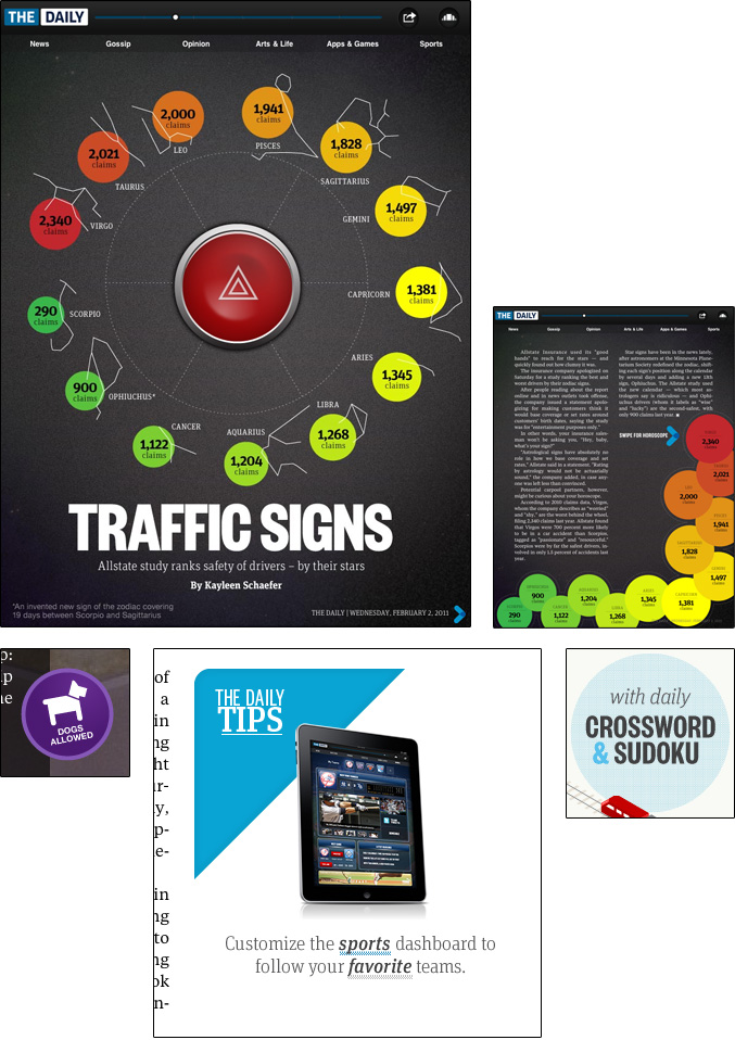
At last, The Daily is here. We've known about it at Joe Zeff Design for some time, having been engaged by News Corp. last fall to contribute artwork for prototypes. It's changed considerably since then, yielding an application with many plusses and minuses. On the plus side, the app is attractive and brimming with content. A Cover Flow-like carousel turns every page into an entry point, with labels that show which pages have already been viewed. The user’s location is billboarded on the home screen alongside the hyperlocal time and temperature — a nice personal touch. Engagement opportunities abound — polls that yield real-time results, interactive crossword and Sudoku puzzles, and real-time tweets on many of the pages. Sports fans will appreciate the customizable sports dashboard with live news feeds about your favorite teams. The Daily includes advanced sharing tools, enabling readers to give an article a thumbs up or down and even record an audio comment, offering the potential to turn every article into a conversation.

Above: Step right up to the carousel of content.

Pretty impressive. It’s easy to see where Rupert spent $30 million in development costs.

That said, there’s considerable room for improvement.

The content feels old. Because it is old. It makes no sense to build a state-of-the-art app around the anachronistic daily news cycle. Online news should reflect immediacy, with up-to-the-second words and pictures. One article cites Punxsutawney Phil’s accuracy rate but fails to tell the reader whether the groundhog saw his shadow this morning. (He didn’t.) That’s inexcusable. If the technology exists to put Twitter feeds on news pages and real-time wire copy on sports dashboards, then those same tools should be used to provide updated, time-stamped content in every section, including the front page headline and image.

The navigation could be sharper. Throughout the app, graphics that look like buttons don’t act like buttons, which frustrates the user. On one page there’s literally a flashing red button in the middle of the page. It does nothing other than flash red. A graphic promoting the sports dashboard fails to take you to the sports dashboard, and a buttonlike callout teasing the daily puzzles turns out to be just that — a tease. Web links that appear in text are just as untappable.

Above: They sure look like buttons.

The app contains video and audio summaries of the news that seem unnecessary. They are buried under the carousel, completely disconnected from the rest of the publication, and redundant to the content that appears elsewhere in the app. A much better use of these features would be to update them hourly.

I'm hopeful The Daily will evolve, and push other newspapers to keep pace. With all of the fanfare surrounding The Daily, I was hoping for a truly interactive newspaper — “new journalism” as Rupert himself put it. I’m not seeing it. Yet.

Update: The Day After, 8 a.m.

Day 2 is definitely an improvement over Day 1. Few if any fake buttons — today the sports dashboard link works. Nice interactive features: a pre-shooting interview with Gabby Gifford; a 360 view from an unaffordable luxury box at the Super Bowl; a fun video interview with Fox Sports cousins Terry Bradshaw and Howie Long about their Super experiences; an invitation to submit letters to the editor via e-mail; and more.

And The Daily reports that the groundhog did in fact see his shadow. A day ago.

WoodWing World Tour

Joe Zeff Design is excited to be part of the WoodWing World Tour, which arrives in San Francisco on March 9 with insight and information about tablet publishing. WoodWing is a Netherlands-based company that creates software to help publishers efficiently push content to iPads, Android tablets and other platforms. Its clients include Time Inc., American Express Publishing, and Project, the highly publicized iPad-only magazine produced by gazillionaire Richard Branson. We've used WoodWing's Enterprise Publishing System and Digital Magazine Tools to create our own apps, and to help clients pursue unique publishing strategies that optimize content, technology and business opportunities.

The San Francisco event brings together an authoritative group of speakers:

Roger Black, the influential newspaper and magazine designer, presents his views on the evolution of publication design. Over the past year Roger has played a particularly active role in that evolution, starting several companies to meet the needs of digital publishers: Webtype, Ready-Media, Treesaver and Nomad Editions. Roger is not only smart, he's sensible, and we're looking forward to his take on where publishing goes from here.

Rebecca McPheters, CEO of McPheters and Company, will discuss best practices for digital publishers. Her company's iMonitor service tracks more than 1,000 apps in 40 countries and recently chose the 10 best apps of 2010 — seven of which were produced using WoodWing's Digital Magazine solution. Jochem Wijnands of TRVL Magazine will talk about his popular iPad-only magazine, which follows an a la carte approach toward magazine publishing by offering apps containing individual articles instead of the traditional mix of content. According to Computerworld, it's an "iPad publishing success story."

Our session will focus on digital publishing strategies that maximize the creative, technical and business opportunities afforded by the iPad and other tablets. The presentation is intended for anyone interested in developing content for tablets, whether you're already producing apps or just beginning to explore the possibilities. We'll provide insight into how to reinvent your content, workflows and business models to take best advantage of the tablet publishing opportunity.

WoodWing's leadership will showcase their newest Enterprise and Digital Magazine releases, which currently power nearly 200 iPad apps, as well as enhancements intended to provide similar functionality for Android devices and HTML5 browsers. You won't want to miss Channel Evangelist Jeff Gapp's demonstration of how HTML5, JavaScript and WoodWing's Digital Magazine Tools converge on the tablet to deliver enhanced interactivity. We've been fortunate to work directly with Jeff to inject HTML5 into our own projects, leveraging two of WoodWing's biggest strengths — its extensibility to work with other code, and Jeff himself.

Advance registration is required but admission to the World Tour event is free. Register here, and learn more about the two-day workshop (which is not free) that follows the conference — an opportunity to build your own app project using WoodWing's Digital Magazine Tools and take it home on your own iPad.

10 Takeaways from the SPD Judging

As a judge at the Society of Publication Designers' annual competition this past weekend, I had the opportunity to scrub, scroll and swipe through hundreds of iPad apps and websites over the course of an exhausting yet exhilarating day at the Fashion Institute of Technology in New York City. The contest continues to attract thousands of print entries — far more than the 250 or so digital entries that our jury evaluated, a number that will undoubtedly soar over the next few years. We were the first to judge magazines published on the iPad, and encountered the best, the worst, and everything in between. Ten takeaways, in no particular order:

1. Generally speaking, tablet apps are significantly harder to access than websites. They must be bought, downloaded, launched and navigated. Each has its own learning curve, required of experienced users as well as new ones. To justify the effort and expense, apps should reward the user with enhanced interactivity, quality multimedia, better usability — something that makes them more worthwhile than what can be accessed more easily on a phone, website or newsstand. That's not happening as much as it should.

2. It is one thing to target readers, and another to engage users. The best apps did the latter, and instead of simply displaying photography they allowed users to rotate objects, show and hide captions, turn on and off layers, flip through slideshows and hear audio. Active imagery (that responds to touch) was more satisfying than passive imagery (that doesn't respond to touch), as it put the consumer in control of the experience and encouraged interaction.

3. Martha Stewart produces stunningly beautiful apps. I'm not much for cookies and peonies, but Martha's minions put on a great show.

4. Check out TweetMag, which seems to be the second coming of Flipbook, which should make every pubilsher consider whether they are doing enough to combine their own content with user-generated content in order to deliver a uniquely personalized experience.

5. We were provided earbuds, and I found that I used them frequently when reviewing websites and hardly at all when reviewing apps. The websites we reviewed tended to integrate audio with photography and video, while the apps kept audio and video trapped in picture boxes retrofitted from their magazine layouts. Eventually, digital magazines will evolve into interactive experiences in which covers become doors and pages become rooms. Marie Claire inspired hope by producing an app that looked nothing like a magazine. Hopefully more will follow.

Intermission.

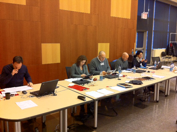
The digital judges . . .

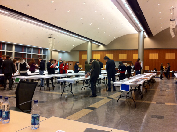
. . . and our view of Jurassic Park . . . I mean, the print judging!

End of intermission. Please return to your seats.

6. It's more honest to embed multimedia content into apps, resulting in bigger filesizes, than to deliver smaller apps that require streaming content. Users are quickly frustrated when confronted with blank boxes — IOUs for content that should have been part of the app they downloaded but instead appear as "Loading" and "Internet Connection Required" messages. Better to make consumers wait once for the entire app that puts all of the content on their iPad than to make them wait every time they land on a screen full of IOUs for streaming content that is contained elsewhere. Right?

7. The New York Times represents the evolution of our species. Its ability to consistently produce superior video, photography and infographics, each bursting with conceptual brilliance that is so spare yet so smart, is an inspiration.

8. Usability matters. Many times I'd quickly swipe from page to page only to get stuck on a specific page because the designer put a slideshow under my finger. Other times I'd scroll vertically into an article only to get lost, not knowing whether my swipe into the next page was putting me where I needed be in order to see every page. (See Takeaway No. 9.) Design not only for the 8 million people who already own iPads, but the millions more who will buy them and use them for the first time. If you confuse them, you'll lose them.

9. If magazines insist on pages that scroll vertically instead of flowing content onto an adjacent screen, they must figure out ways to make that decision clearer to the user. It's too easy to miss content, leaving the reader feeling shortchanged, or stupid, or both.

10. There was considerable debate about the merits of publishing both vertical and horizontal magazines. It's an added burden for exhausted staffs now struggling to add an Android edition to their strained workflows. One art director said his publication published bi-dimensionally because Apple required it, another said that advertisers liked the idea of seeing their ads twice. One justification for publishing vertical-only magazines overhead at the lunch table: "You wouldn't turn a magazine on its side, why would you turn an iPad magazine on its side?" Interesting point.

Many thanks to SPD, particularly executive director Emily Smith, Pub 46 co-chairs Andrea Dunham and Brandon Kavulla, digital chair Jeremy Lacroix and SPD Veep Josh Klenert. See you at the Gala!

Out of this world! Solar System for iPad

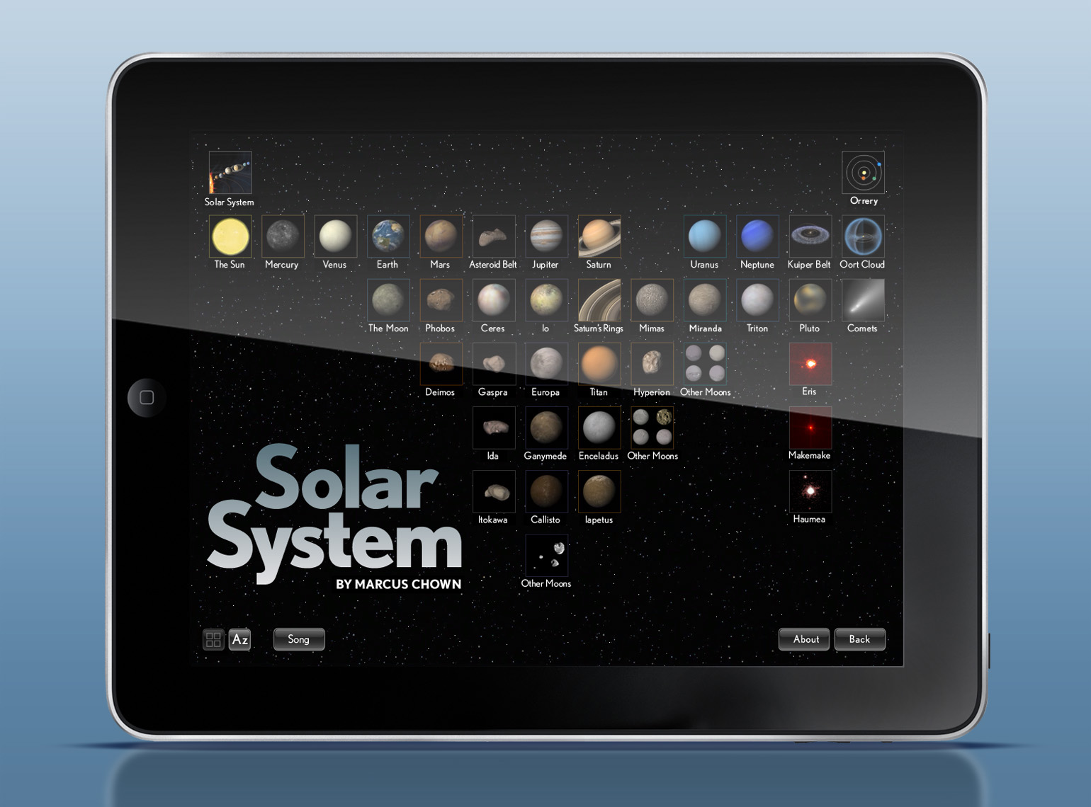
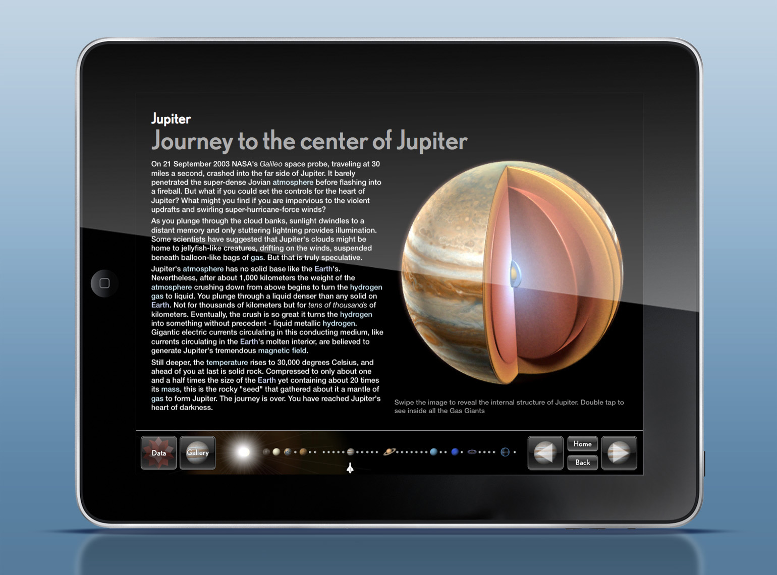
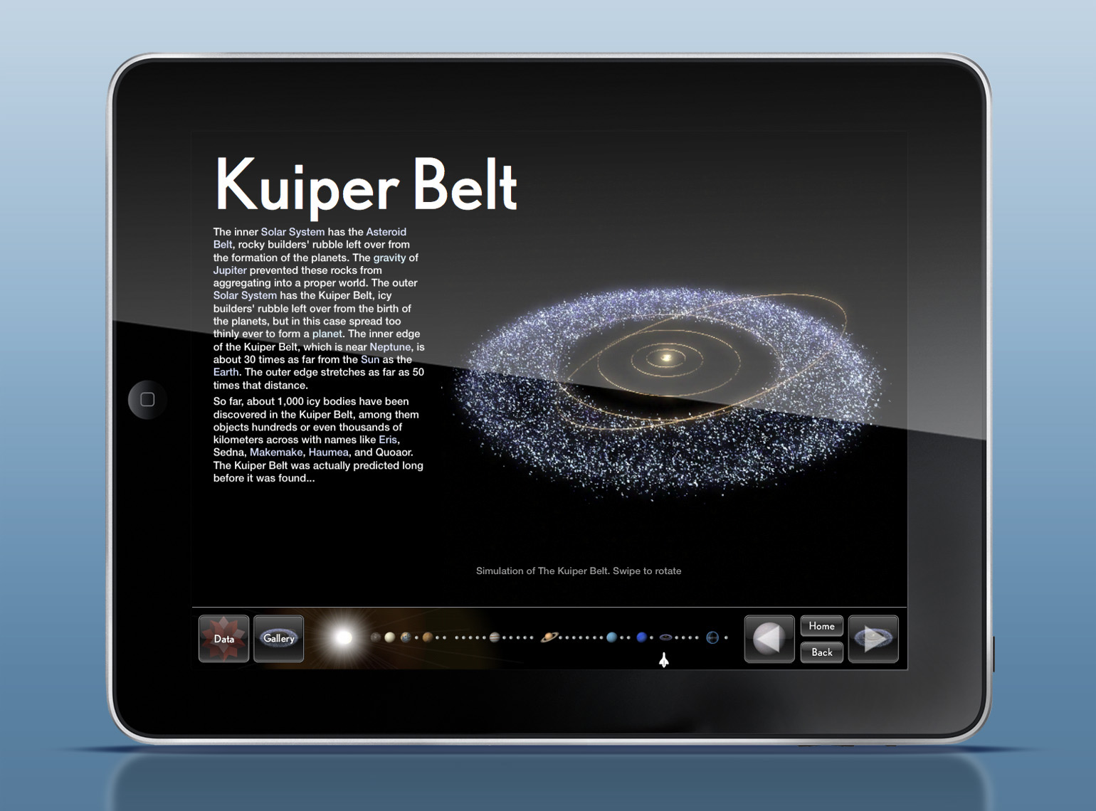
We're excited to announce that "Solar System for iPad," a breakthrough electronic book published by Touch Press and Faber and Faber in association with Planetary Visions and Joe Zeff Design, is now available in the iTunes App Store. Touch Press is best known for its debut offering, "The Elements," one of the most successful eBooks in the App Store with more than 160,000 copies downloaded at $13.99 apiece. We've been collaborating with Touch Press since June on the design of "Solar System," working closely with CEO Max Whitby, Creative Director Theodore Gray and Producer Richard Turnnidge.

"It has been a real pleasure working with Joe Zeff Design, who bring years of experience in delivering the highest quality illustrations and information graphics to the iPad," said Whitby. "They are consummate professionals. We look forward to publishing further ground-breaking titles with their help."

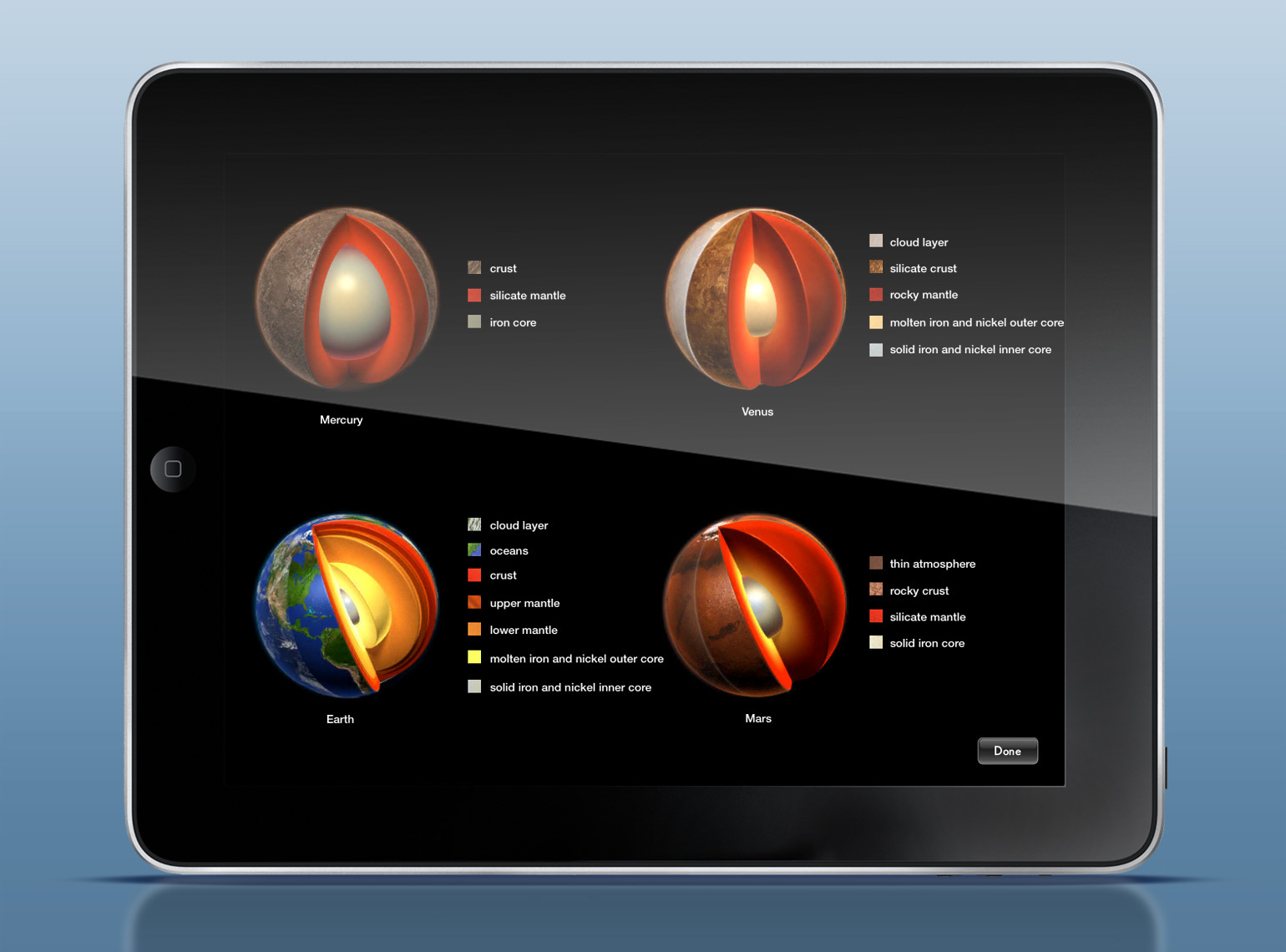
Joe Zeff Design collaborated with Touch Press on the design of the eBook, including the application icon, splash screen, the Elements-inspired home page, layout templates and navigation. Further, we created several key illustrations and interactive animations, including cutaways of each planet rendered in LightWave 3D that allow the viewer to peel open each planet to see what’s inside.

More screen captures and sample animations are available for viewing here, or by purchasing the eBook from the App Store here, just in time for Christmas!

"Solar System for iPad" is written by best-selling author Marcus Chown, and opens with a specially composed Björk song to begin the intergalactic adventure. Inside are more than 150 beautifully presented story pages with interactive scenes, videos and 3D objects. Each section includes up-to-the-second astromomical information from Wolfram I Alpha, as well as image galleries that bring the wonders of space to the iPad screen. More details here.

Adds Gray, creator of "The Elements:" "What sets Solar System for iPad apart more than anything is that it is not just an app or reference guide or tour, it’s a real honest-to-goodness book you can sit down and read."

Many thanks to Max, Theo, Richard and the entire team at Touch Press. Looking forward to more exciting projects together.

TIME Person of the Year

TIME magazine announced its Person of the Year this morning: Facebook founder Mark Zuckerberg. Wrote Managing Editor Rick Stengel: “For connecting more than half a billion people and mapping the social relations among them (something that has never been done before); for creating a new system of exchanging information that has become both indispensable and sometimes a little scary; and finally, for changing how we all live our lives in ways that are innovative and even optimistic, Mark Elliot Zuckerberg is TIME's 2010 Person of the Year.”

Read more here.

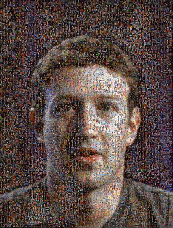
Here’s the image we created for the magazine — a mosaic based on a few thousand images that TIME readers submitted to Facebook earlier this year for a cover story that we also illustrated, and a photograph provided by TIME by Tony Avelar/Bloomberg/Getty Images:

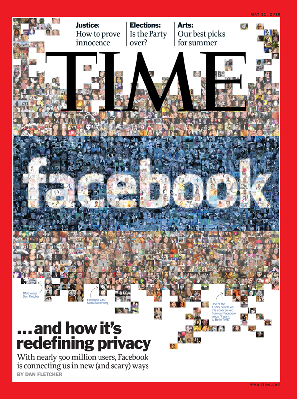
And here’s the image we created earlier this year for another cover.

Thanks to Rick, Design Director D.W. Pine and everyone at TIME.

See our gallery of mosaic images here.

iOS 4.2.1 Update

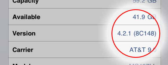
What's the point of having the latest gadget without the latest software? Be sure to update your iPad to the current software in order to enjoy the latest Apple upgrades, such as multitasking, folders, AirPrint, Find My iPad — and our hot-off-the-Pad app: Splashlight studio tour! How to check your software version 1. On your iPad, tap Settings, then General. 2. On the right side, note the version. It should be 4.2.1. 3. If not, you're cheating yourself out of a lot of great features.

Updating to iOS 4.2.1 automatically via iTunes 1. Download iTunes 10.1 from here. 2. Connect your iPad to the computer. 3. iTunes shows an iOS 4.2.1 update message. 4. Click the “Download and Update” button to update iPad to iOS 4.2.1.

More info http://www.apple.com/ios/ http://support.apple.com/kb/DL1060

Note that Apple won't let you download apps larger than 20 megabytes over 3G. You need a WiFi connection or an iTunes download that you sync that big ol' app to your iPad.

Our First App: Splashlight studio tour

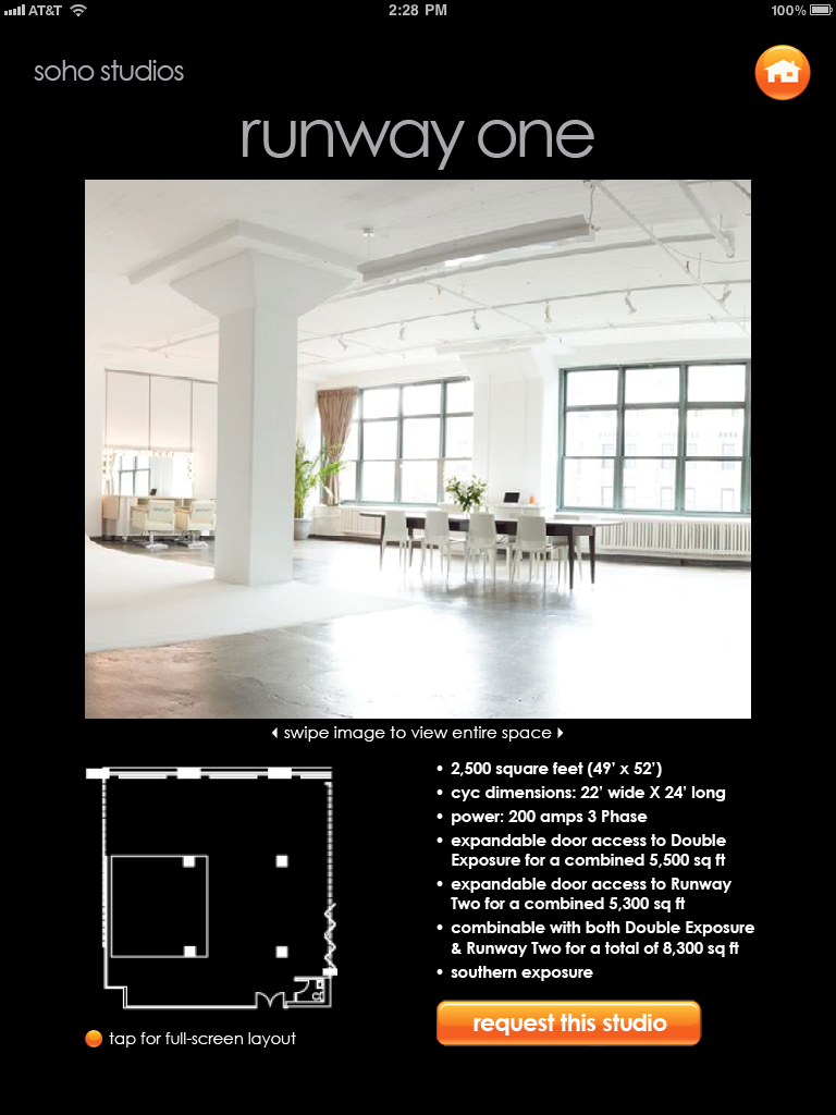
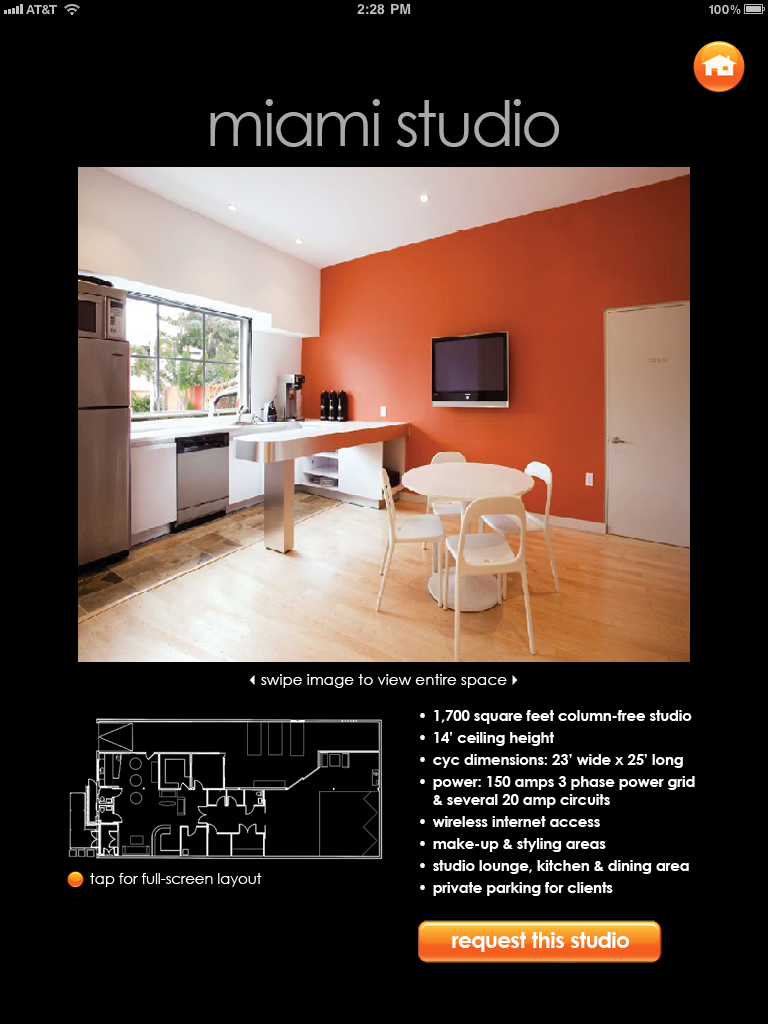
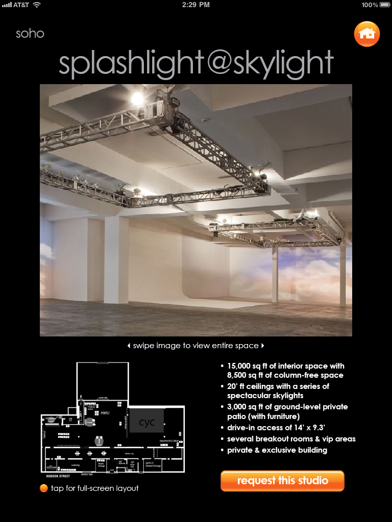
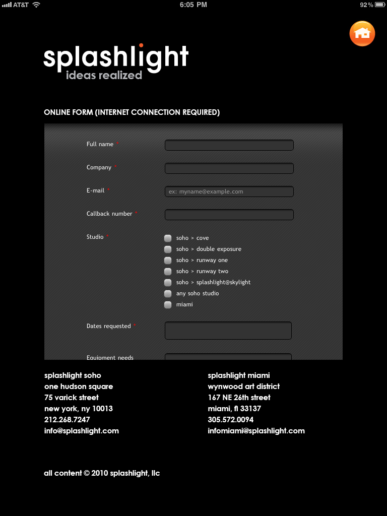
We're pleased to announce that our very first iPad app has landed at the App Store. Splashlight studio tour offers a multimedia-rich excursion into some of the most exclusive photo studios in New York and Miami, complete with behind-the-scenes video, slideshows, panoramic views of each studio, blueprints and dimensions, and an online form to begin the booking process. Best of all, it's free. Check it out at here.

The app was built using WoodWing's Digital Magazine Tools, the same framework used by Time Inc. and other publications to develop their iPad editions. Joe Zeff Design is a Silver Authorized Solution Partner of WoodWing — one of only two in the New York City area — and thanks WoodWing for its support in producing the app, which we expect to be the first of many. Further, we look forward to working with WoodWing clients throughout the world on their iPad and Android publications.

The app took less than a week to create, leveraging assets that Splashlight had already collected for its new website. We were already aware of Splashlight's capabilities, having spent 15 months in their Soho studios as their in-house creative team. WoodWing provides an Adobe InDesign-based workflow, which allowed us to focus less on programming and more on design and interaction. We created both vertical and horizontal orientations, and included a help screen. The app was submitted to Apple on Nov. 30 and approved two weeks later.

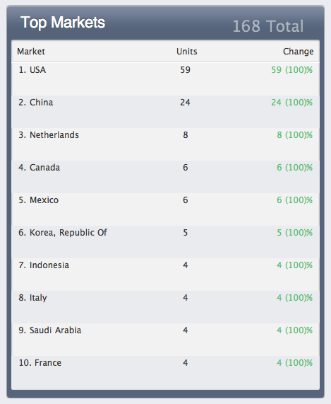
We're learning volumes. On its first day, with no promotion whatsoever, the app was downloaded 168 times. Here's the breakdown of where:

(Dec. 14 update: After three days we have 613 downloads, and we're ranked No. 30 in the "Top Photography Free iPad Apps" category on iTunes.)

Maybe it's the supermodel on the home page of the Splashlight app that's generating all of the attention. In any event, here are a few screen captures. There are more images in our iPad gallery here.

Give My Regards to Broadway . . .

It's our Broadway debut, produced for SpotCo to promote Whoopi Goldberg's upcoming musical comedy. We created computer-generated typography using LightWave, rendering a vertical and horizontal version. Here's how the vertical appeared in a full-page ad in The New York Times . . .

. . . and the horizontal version on the web at sisteractthemusical.com:

Shoutouts to Chris O'Riley for modeling the type and Ed Gabel for his masterful Photoshop work. And thanks to Gail, Jeff and Melissa at SpotCo — now if we can just score some tickets . . . Hint, hint!

Summer fun

Apologies for the sporadic blogging — it's been a busy summer, between major projects for PepsiCo, an eBook project for the iPad, and 95-degree motorcycle rides. We're working on several magazine covers at present, and just finished this one for Entertainment Weekly:

Many thanks — again — to Amid Capeci at EW!

Helping Will Ferrell Get Some Tail

It's all in a day's work, and not as lascivious at it sounds. We put a computer-generated tail on Ferrell for the cover of Entertainment Weekly's Best of Summer Issue, which comes out today. In his virtual mermaid costume — actually, it's a merman costume — Ferrell and Mark Wahlberg strike a pose to draw attention to their upcoming action-comedy, "The Other Guys."

Many thanks to Design Director Amid Capeci and Managing Editor Jess Cagle for a terrific assignment. A glimpse behind the scenes:

Mac Daddy

We're excited about the new Macworld cover, our tenth for art director Rob Schultz:

Many thanks to Rob and the editors of Macworld, one of our favorite magazines. Here are the others we've done over the past five years — everything you see here is computer-generated:

One Slick Cover

Our Newsweek cover oozes with computer-generated imagery, which made possible a one-day turnaround with no messy cleanup! Many thanks to Bonnie and Michelle — and Jon, of course — for the cover assignment, our first for Newsweek since Stephen Colbert a year ago, and hopefully not our last . . .

Interesting to note that Newsweek's cover no longer appears on the front page of its newly redesigned website. The screen capture above came from Newsweek's new iPad app. As magazines transition to digital, it's worth considering the significance of the cover. By abandoning it, a publication fails to capitalize on its most valuable branding element, the one with which readers are most familiar. Moreover, it signals a new issue with new content, and telegraphs the magazine's unique point of view. On the newsstand it lassoes the consumer through surprise, curiosity, emotion, sophistication, beauty and habit, and on the screen it does no less. Whether in pixels or on paper, the cover still matters.

Our last Newsweek cover, working with the fabulous Nigel Parry.

colbertforblog.jpg

Little Pictures, Big Stories

We've been experimenting with software that turns thousands of photographs into one large mosaic, with exceptional results. We've added some of our own R&D that has resulted in two really great magazine covers, one for Time and another for TV Guide. In both cases, the mosaics had lifespans beyond the print magazines — we created a downloadable poster for TV Guide and Time published a supersized mosaic in its iPad edition.

Our Time cover:

fb2.jpg

Our TV Guide poster:

poster_16x20dd.jpg

And another image we did as a test:

eye.jpg