10 Takeaways from the SPD Judging
As a judge at the Society of Publication Designers' annual competition this past weekend, I had the opportunity to scrub, scroll and swipe through hundreds of iPad apps and websites over the course of an exhausting yet exhilarating day at the Fashion Institute of Technology in New York City. The contest continues to attract thousands of print entries — far more than the 250 or so digital entries that our jury evaluated, a number that will undoubtedly soar over the next few years. We were the first to judge magazines published on the iPad, and encountered the best, the worst, and everything in between. Ten takeaways, in no particular order:
1. Generally speaking, tablet apps are significantly harder to access than websites. They must be bought, downloaded, launched and navigated. Each has its own learning curve, required of experienced users as well as new ones. To justify the effort and expense, apps should reward the user with enhanced interactivity, quality multimedia, better usability — something that makes them more worthwhile than what can be accessed more easily on a phone, website or newsstand. That's not happening as much as it should.
2. It is one thing to target readers, and another to engage users. The best apps did the latter, and instead of simply displaying photography they allowed users to rotate objects, show and hide captions, turn on and off layers, flip through slideshows and hear audio. Active imagery (that responds to touch) was more satisfying than passive imagery (that doesn't respond to touch), as it put the consumer in control of the experience and encouraged interaction.
3. Martha Stewart produces stunningly beautiful apps. I'm not much for cookies and peonies, but Martha's minions put on a great show.
4. Check out TweetMag, which seems to be the second coming of Flipbook, which should make every pubilsher consider whether they are doing enough to combine their own content with user-generated content in order to deliver a uniquely personalized experience.
5. We were provided earbuds, and I found that I used them frequently when reviewing websites and hardly at all when reviewing apps. The websites we reviewed tended to integrate audio with photography and video, while the apps kept audio and video trapped in picture boxes retrofitted from their magazine layouts. Eventually, digital magazines will evolve into interactive experiences in which covers become doors and pages become rooms. Marie Claire inspired hope by producing an app that looked nothing like a magazine. Hopefully more will follow.
Intermission.
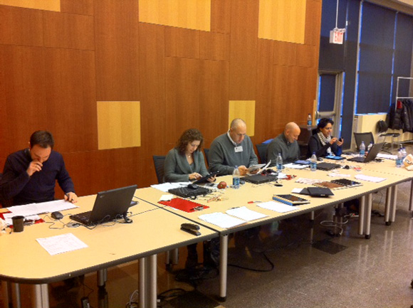
The digital judges . . .
. . . and our view of Jurassic Park . . . I mean, the print judging!
End of intermission. Please return to your seats.
6. It's more honest to embed multimedia content into apps, resulting in bigger filesizes, than to deliver smaller apps that require streaming content. Users are quickly frustrated when confronted with blank boxes — IOUs for content that should have been part of the app they downloaded but instead appear as "Loading" and "Internet Connection Required" messages. Better to make consumers wait once for the entire app that puts all of the content on their iPad than to make them wait every time they land on a screen full of IOUs for streaming content that is contained elsewhere. Right?
7. The New York Times represents the evolution of our species. Its ability to consistently produce superior video, photography and infographics, each bursting with conceptual brilliance that is so spare yet so smart, is an inspiration.
8. Usability matters. Many times I'd quickly swipe from page to page only to get stuck on a specific page because the designer put a slideshow under my finger. Other times I'd scroll vertically into an article only to get lost, not knowing whether my swipe into the next page was putting me where I needed be in order to see every page. (See Takeaway No. 9.) Design not only for the 8 million people who already own iPads, but the millions more who will buy them and use them for the first time. If you confuse them, you'll lose them.
9. If magazines insist on pages that scroll vertically instead of flowing content onto an adjacent screen, they must figure out ways to make that decision clearer to the user. It's too easy to miss content, leaving the reader feeling shortchanged, or stupid, or both.
10. There was considerable debate about the merits of publishing both vertical and horizontal magazines. It's an added burden for exhausted staffs now struggling to add an Android edition to their strained workflows. One art director said his publication published bi-dimensionally because Apple required it, another said that advertisers liked the idea of seeing their ads twice. One justification for publishing vertical-only magazines overhead at the lunch table: "You wouldn't turn a magazine on its side, why would you turn an iPad magazine on its side?" Interesting point.
Many thanks to SPD, particularly executive director Emily Smith, Pub 46 co-chairs Andrea Dunham and Brandon Kavulla, digital chair Jeremy Lacroix and SPD Veep Josh Klenert. See you at the Gala!


